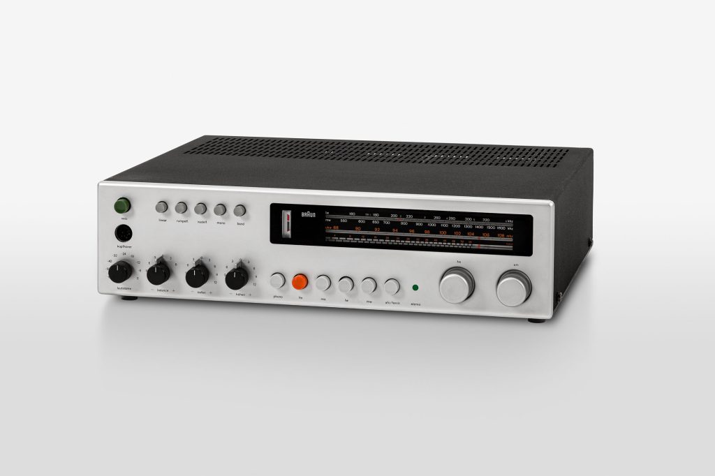
Here too, a striking red-orange: the central FM radio button of the regie 500 control unit from 1968
© rams foundation
FM Radio: Red-Orange
Dieter Rams and Colours
Gerrit Terstiege
It is precisely because colours play a seemingly subordinate role in the work of Dieter Rams that they are assigned great significance. A contradiction?
Currently, many manufacturers are avoiding the use of set colours, especially in furniture, product, and automotive design. The palettes are becoming increasingly wide-ranging, the available colour gradations more and more abundant. Beyond the shades regarded as ‘trend colours’, other effective surface variations can be achieved in many cases today: from the shiny golden limousine to the SUV with an especially matt finish. Anything is possible, and anything can be individualised through colour. Nowadays, aesthetic decisions that used to be made by designers alone are increasingly being handed over to the customer. What is entirely lost in this development is a creative approach to colours that resembles the one we know from Rams’ time at Braun. Once one realises just how greatly a colour can change a product, that even a neutral design can be transformed into an eye-catching or vulgar object, then one can only respond to this phenomenon with scepticism.
The designs by Dieter Rams for Braun, on the other hand, are characterised by a subtle use of colour and are mostly achromatic colours in shades of grey, white, and black. Furthermore, according to Rams in his book Weniger, aber besser /Less, but better, there are ‘actual metal surfaces such as natural or dark anodised aluminium and velour chrome’. He employed shiny chrome elements, for example on antennas or carrying handles, very sparingly and prudently. Monochrome products with bold colours were increasingly on offer by Braun in the first half of the 1970s, echoing the predominant furnishing style of those years, which was notable for its bold colours. Braun tended to use striking shades more for small-format, hand-held appliances such as shavers, travel hairdryers, table lighters, or alarm clocks. The larger and more technically complex a product, the more restrained the use of bright colours. With a large-format, black housing such as the audio 308 compact system, the selectively assigned colours have a much more powerful effect and distinguish the overall appearance. Since the 1960s, there has been almost no Rams product without at least one bright colour. These coloured features always have a clearly recognisable indicating function on push-button switches.
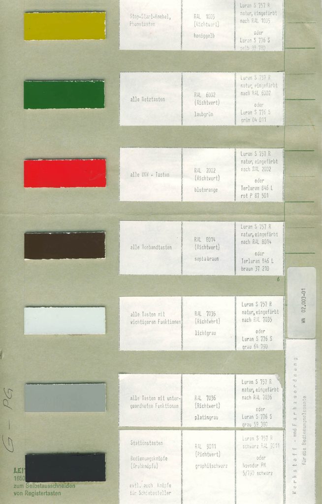
A colour chart with seven defined allocations for certain functions of Braun audio devices demonstrates this: FM buttons should be ‘blood orange’, phono buttons ‘honey yellow’, with all power buttons ‘leaf green’. This function, which supports operation, is easy to understand because it creates a link between the orange FM button of the regie 500 and the scale digits in the same colour. One does not need to read long operating instructions to understand such correlations. They are immediately obvious. However, if one takes the T52 and its technical and colour variants (in off-white, light grey, dark grey or grey-blue) for example, the aesthetic dimension of the choice of colour becomes ever clearer, due to the interplay of the colour shades. One example thereof is the offsetting of the rotary knobs from the push buttons and from the body, which makes the small radio a truly fine-looking object that is pleasing to the eye even when it is simply switched off on the shelf.
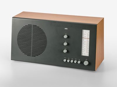
This is where Rams’ typical aesthetic sensitivity, his special sense for colour nuances and their harmonious combinations, becomes apparent. These colour dialogues—in reference to the book by the Bauhaus artist Josef Albers titled Interaction of Color—concern not only the coordinated shades of lacquers or plastics, but also the colour nuances of different materials. A particularly successful example of this is the RT 20 radio, produced from 1961 onwards, of which there are two versions. In the first, the steel front, which is painted in off-white, is paired with beech veneer, while in the dark version, the anthracite-coloured front is combined with pear veneer. Not to mention the warm yellow tone of the dial illumination. Both the colour and material combinations of the RT 20 harmonise and offer two completely different impressions of the same unit. Here there are options that were not considered necessary a few years earlier with the SK4, nicknamed Snow White Coffin. But for the RT 20, they left it at these two-colour schemes and did not launch five or ten more onto the market. This deliberate colour restriction, typical of Rams, can still be found today in the current palette of upholstery fabrics in his Vitsœ chair line: linen upholstery is only available in four muted shades and the leather upholstery only in six colours. Exceptions or custom designs are not sanctioned.
Dietrich Lubs, who joined the Braun design team in 1962 and made major design contributions there for almost four decades, can provide valuable information on the design approach to colours at Braun during the Rams years. When I asked how colours were selected in the first place, Lubs remembers: ‘We didn’t just use standard RAL colours, even when they functioned as a guideline. Instead, we also mixed our own colours. This was common practice even before I came to Braun. We painted our own colour cards with nitro colours and tested them on the model. If we weren’t convinced by a colour shade, the model was resprayed.’ This search for exactly the right colour shade was sometimes tedious and time-consuming: ‘… that was the worst of all,’ says Klaus Zimmermann with a laugh, the long-standing head of the model-making department at Braun. This is because too many layers of paint ruined details and proportions on the model. Zimmermann explained that, ultimately, it was necessary to find exactly the right granulate mixture for the production of a colour shade on the model. One realises that what seems obvious and self-evident today had to be worked out step by step in the design process.
The Braun pocket calculator ET22 control (1976) was truly exemplary with its convex keys that produce highlights. A joint project by Lubs and Rams that was to achieve world fame. Indeed, the initial versions of the iPhone’s Calculator app can certainly be understood as a digital homage. Yet, as far as the placement of colours and the size and arrangement of the keys are concerned, the current version in iOS 16 is an example of how an ever-increasing simplification of the graphical interface can also mean a loss of intuitive ease of use and aesthetics. Compared to the original, the app in the current version no longer seems like a homage, but instead watered down. After all, Rams and Lubs consciously chose yellow for a single button: the one that displays the result after a calculation has been performed. Nowadays, five yellow keys in the app provide potential for confusion among the various forms of arithmetic. Regarding yellow: Dietrich Lubs‘ choice of this colour for the second hand of the wristwatches, wall clocks, and alarm clocks he designed is a striking element that still resonates today. Lubs stated: ‘The yellow second hand was also important to me as a unique selling feature that increases recognition. Other manufacturers already had white, black, red and green second hands. Yellow ones didn’t yet exist. That’s why the colour was used for all Braun watches and alarm clocks. Until today.’
Dieter Rams succinctly summarised his attitude to product colours in a filmed interview for the gestalten publishing company: ‘As far as colours are concerned, I have always been very cautious. (…) There were a few products where I was prepared to accept colour. I like colours—but they have to suit the product. Colour can dominate a room. And design shouldn’t dominate people, it should help people.’ One aspect is apparent and that is that the colour decisions Rams has made over a long life do not, of course, only apply to the designs of Braun or Vitsœ—there is also a sensitive use of colours in non-produced objects such as the containers of an envisaged cosmetics series by Braun or the concept for a Lufthansa tableware. And in his personal environment, the silver of his Porsche, the special olive shade of some doors in his house, and the colours of his garden plants catch the eye, in much the same way as the wonderfully faded blue of his Bofinger chairs, or the red of the Valentine typewriter. And last but not least, the colour of his jacket at his many public appearances in the last decades makes it abundantly clear who is standing before one. It is ‘Mr. Braun’.
Left: Cardboard with colour-coded buttons for Braun players, c. 1965
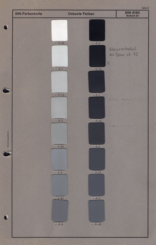
Right: Colour chart defining the black shade of shaver cables, c. 1980
© P&G / Braun Collection
More Contributions
Dieter Rams.
A Style Room
Rams Design for Braun
